

Yes, small text can stay legible on patches if you match the letter height to the production method. Embroidery needs a minimum letter height around 5-6mm for clean stitching, while heat-applied printed patches can hold crisp text as small as 2-3mm. If your design leans on tiny lettering, a heat-applied method like the one Octopatches uses generally preserves fine strokes better than a needle ever can.
TL;DR:
Embroidery typically requires a minimum letter height of 5-6mm for clean results, with finer text prone to blurring or filling in.
Heat-applied / Octopatches can hold text as small as 2-3mm, making them ideal for tiny lettering and detailed logos.
Simple sans-serif fonts with large x-heights and open counters are best suited for small text, while script or condensed fonts often fail at tiny sizes.
Proper digitizing techniques, including stabilization, stroke compensation, and appropriate stitch types, are crucial to maintaining legibility in embroidered patches.
Heat-applied patches using various faux materials can reproduce fine details more reliably than embroidery, especially for high-precision or small-font design needs.
Table of Contents
How Small Is Too Small for Text on Patches?
Letter height is the number that decides whether your patch reads clean or turns into a smudge. For embroidered patches, most digitizers recommend a minimum cap height of 5mm (roughly 14 point) for simple block letters, and closer to 7mm (about 20 point) if the font has any serifs, curves, or thin strokes. Drop below that and the thread starts fighting the letterform. Loops close up, counters (the enclosed spaces in letters like “e” or “o”) fill in with thread, and the whole word can blur into a gray smudge instead of readable text.
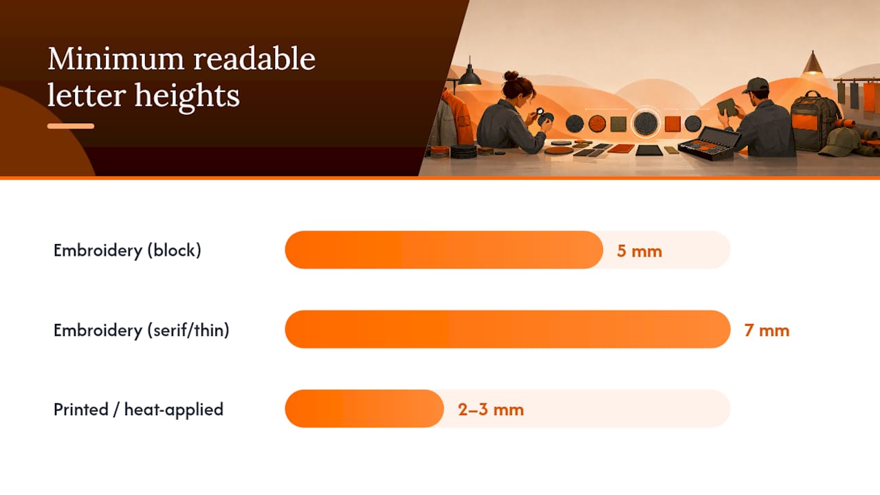
Heat-applied printed patches play by different rules. Because the design comes from a printed or heat-transferred layer instead of a stitched line, letter heights down to 2-3mm can still hold their shape, which is why Octopatches sees so many customers move fine-print logos and taglines over to this method instead of forcing them through embroidery.
Patch size sets the ceiling on how much text fits at all, and it comes down to real estate:
-
1-inch patch: room for one short word or a few-letter monogram
-
2-inch patch: one line of 8-12 characters, or two short lines if the font is condensed
-
3-inch patch: two to three lines, roughly 15-20 characters each, before it starts feeling cramped
A useful working number: for embroidery, plan on roughly 3-4 characters per inch of patch width using a mid-weight sans serif font. Printed and heat-applied methods can push closer to 5-6 characters per inch since there’s no stitch width eating into the space between letters.
Best Fonts and Letterforms for Small Text on Patches
Font choice matters as much as size once you get into the small-lettering range. Simple sans-serif fonts with a large x-height (the height of lowercase letters like “x,” “n,” and “o” relative to the capital letters) are the safest starting point, because they keep strokes thick and even at tiny scale. Heavy-weight slab serifs work too, as long as the serifs themselves aren’t thin decorative flourishes.
What to prioritize when picking a typeface for small lettering on patches:
-
A generous x-height so lowercase letters don’t shrink into illegible dots
-
Open counters, meaning the enclosed spaces in letters like “a,” “e,” and “g” stay visible instead of filling in
-
Consistent, sturdy stroke width across the whole letterform, no hairline sections
-
Rounded or squared terminals rather than sharp, thin points that fray or blur
Fonts to avoid entirely at small sizes: thin or light-weight sans-serifs, script and cursive fonts with connecting flourishes, condensed fonts with tight letterspacing, and anything with fine serifs or decorative swashes. The failure mode is predictable. Thin strokes on embroidery either drop out during digitizing or turn into a solid blob of thread. Scripts fail because the connecting strokes between letters merge into the neighboring stitch and the word loses its shape entirely.
Pro Tip: Print your text at the actual finished patch size on paper first, then step back three feet and squint. If you can’t read it clearly from that distance, neither will anyone looking at the patch on a jacket.
Embroidery and Digitizing Rules for Legible Small Text
Digitizing is the process of converting your artwork into a stitch file, and it’s where small text either survives or falls apart. The core decision is satin stitch versus run stitch. Satin stitch, a dense zigzag that fills a shape edge to edge, works well for strokes between roughly 1.5mm and 4mm wide. Anything thinner than that and satin stitch starts to look ropey or uneven. Run stitch, a single line of straight stitches, handles hairline details better but reads as thin and less bold, so it’s a poor match for anything meant to look like solid lettering.
Stitch density (how many stitches are packed per square inch) also has a ceiling. Small embroidery fonts require careful density planning, because push it too high and the fabric puckers or the letters bunch into an unreadable clump; push it too low and gaps show fabric backing through the thread.
A few digitizing controls separate a clean small-text patch from a muddy one:
-
Underlay stitching, a foundation layer sewn before the top stitches, stabilizes the fabric so tiny letters don’t shift or distort
-
Compensation, slightly widening thin strokes in the digitized file, keeps letters from disappearing once thread is added
-
Jump stitch control minimizes loose threads between letters that can snag and pull counters open over time
One overlooked factor: digitizing skill matters as much as font selection when text gets tight. An experienced digitizer can sometimes coax a design through embroidery that would otherwise need a size increase or a different production method.
Alternative Methods That Preserve Tiny Text Better Than Embroidery
When your text absolutely has to stay small, embroidery isn’t always the right tool for the job. Heat-applied printed transfers lay down color and line work the way a printer does, which means thin strokes, sharp serifs, and fine details keep their edges instead of getting swallowed by thread width. This is the production route Octopatches built its business around, since it skips the needle-and-thread constraints entirely and reproduces artwork closer to how it looks on screen.
Woven and micro-woven patches sit in between. They use finer thread and a tighter weave than standard embroidery, which lets them handle smaller letterforms and thinner lines than a typical satin-stitch patch, though they still can’t match the precision of a printed edge.
For quick, low-stakes projects, mini letter patches and iron-on letter sets offer a genuine DIY shortcut. These pre-made individual letters, often around 0.7 inches tall, skip the custom-order process entirely.
-
Best for one-off projects, gifts, or testing a name/word before committing to a custom order
-
Limited to whatever fonts and colors the manufacturer offers, so typography choices are fixed rather than custom
-
Not a great fit for branding or anything that needs to match a specific logo font
If the project needs a consistent brand font, custom colors, or more than a couple of characters, a made-to-order heat-applied patch will outperform loose iron-on letters every time.
Design Rules for Spacing, Contrast, and Character Limits
Getting the font and size right only works if the surrounding design choices don’t undo it. These rules apply whether you’re working in embroidery or a printed heat-applied format:
-
Increase letterspacing slightly as letters shrink. Tight tracking that looks fine at 2 inches tall will merge into a solid line at 5mm. Add 5-10% extra tracking for anything under 8mm letter height.
-
Choose mixed case over all caps for anything longer than a single word. Lowercase letters have more distinct shapes (ascenders, descenders, varied heights), which the eye reads faster at small sizes than a uniform block of capitals.
-
Use high-contrast color pairings. Dark thread or ink on a light patch face, or the reverse, holds up far better than mid-tone combinations that blend into the background at a glance.
-
Avoid busy or textured patch backgrounds behind small text. Camo, heather, or heavily textured faux materials can visually break apart thin counters and strokes.
-
Keep to a hard character limit per line. Product specs from patch makers commonly cap lines around 12-15 characters for a 2 to 3 inch patch, and that ceiling drops fast as the patch shrinks.
Pro Tip: If you’re on the fence between two font weights, pick the heavier one. A slightly bolder letterform almost always survives production better than a delicate one, even if it looks a touch heavy on screen.
Why the Fabric and Backing You Choose Changes Legibility
The material behind your stitches or print does more work than most people expect. Tight-weave fabrics like twill or canvas give embroidery needles a stable, dense surface to anchor into, which keeps small stitches sharp and in place. Fleece, boucle, and other loose or fuzzy-textured faces do the opposite. Individual fibers poke up between stitches and blur fine letterforms, especially anything under 6mm tall.
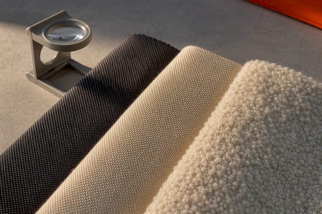
Faux leather and other coated, smooth-faced materials create a different problem for embroidery: needles can perforate and weaken the surface, and stitch tension behaves less predictably on a non-woven face. That’s part of why faux leather, faux suede, and similar coated textures pair so well with heat-applied printed methods instead. The print sits directly on the surface without needing to punch through it, which is exactly the kind of material flexibility that made Octopatches’ faux material lineup worth building around printed application in the first place.
Backing choice affects durability more than legibility, but it still matters for small-text patches specifically. Heat-seal backing bonds the entire patch surface to fabric, which helps keep tiny stitched or printed details from lifting at the edges over time. Sew-on backing gives a more traditional, permanent hold but requires careful stitching around the patch border so the needle doesn’t distort delicate text sitting close to the edge.
How to Apply Small-Text Patches Without Ruining the Detail
Fine lettering is the first thing to suffer from a bad application job, so the attachment method deserves the same attention as the design itself.
-
Set the right heat and pressure. Most heat-applied patches bond well between 300-350°F with firm, even pressure held for 10-15 seconds. Too much heat can scorch thin printed lines; too little leaves edges lifting.
-
Use a pressing cloth or parchment paper between the iron and the patch to protect any raised or textured detail from direct heat marks.
-
Consider a professional heat press for bulk or critical-detail orders. A home iron applies uneven pressure across the surface, which is riskier for patches where even a slightly lifted corner can crack fine text.
-
Add sew-on reinforcement around the perimeter only, keeping stitches at least 3-4mm from any text or logo elements so the needle never crosses into the design itself.
-
Wash inside out on a cold, gentle cycle and skip the dryer’s high heat setting, since repeated high heat is what causes thread fuzzing and slow color migration on fine details over time.
Octopatches has a full walkthrough on pressing patches onto clothing without sewing if you want the step-by-step version before your first order.
What to Put on Your Spec Sheet Before Ordering
A clear spec sheet is the difference between getting your patch right on the first run and paying for a reprint. Hand your patch maker these details up front:
-
Exact text, spelled out character by character, plus your preferred font name or vector outlines if you have them
-
Maximum characters per line you’re targeting, and how many lines total
-
File type: vector formats like AI, EPS, or PDF hold up far better through digitizing and printing than a flattened JPEG or PNG
-
Digitizing notes, if embroidered: request satin stitch for strokes over 1.5mm and flag that you want to avoid thin run-stitch outlines on lettering
-
Thread color or Pantone references so the finished color matches your brand rather than the closest stock shade
-
A physical sample or digital proof before a full production run, especially for anything under 6mm letter height
Double-checking spelling before submitting sounds obvious, but small mistakes get magnified fast at micro scale. A single dropped letter is far more noticeable on a 2-inch patch than it would be anywhere else.
| Spec item | What to specify | Why it matters |
|---|---|---|
| Text and font | Exact wording, font name or vector file | Prevents substitution errors |
| Characters per line | A firm max number | Keeps text from getting shrunk to fit |
| File format | Vector (AI, EPS, PDF) | Preserves sharp edges through production |
| Stitch type (embroidery) | Satin for thick strokes, avoid thin run stitch | Prevents dropout on fine letters |
| Proof/sample | Digital proof or physical sample | Catches legibility problems before bulk order |
How Octopatches Handles Small-Text Patch Orders
Octopatches built its process around heat-applied technology specifically because it sidesteps the stitch-width limitations that trip up embroidery on fine lettering. Instead of forcing thread through tiny letterforms, the design gets applied as a heat-bonded layer that holds thin strokes, small serifs, and tight letterspacing without the thread bulk getting in the way.
There’s no minimum order requirement, which means you can test a small-text design on a single patch before committing to a batch of hundreds. That matters most for exactly the kind of project this article covers: a name, a tagline, or fine print that needs to be checked at actual size before it goes on 50 jackets.
Octopatches offers a wide range of faux materials, from faux leather to denim to carbon fiber, giving you room to pick a face that suits your brand without sacrificing the legibility your text needs. Between the material variety, the no-minimum policy, and the heat-applied process itself, it’s a setup built for exactly the kind of fine-detail work that traditional embroidery struggles to deliver.
Craftsmanship vs. Scalability: An Honest Take on Small Text
Hand embroidery has a texture and warmth that printed patches can’t fake, and there are projects, heirloom pieces, artisan branding, one-off gifts, where that’s worth the size trade-off. If legibility isn’t the top priority, a slightly larger, embroidered wordmark can be the better creative choice.
But for anything meant to be read reliably, a name, a small tagline, a serial-style code, printed and heat-applied methods win on reproducibility. They don’t depend on a digitizer’s interpretation of your font, and every unit comes out matching the last one.
The workflow that avoids regret: mock your text up in vector software at true finished size, order one sample before committing to volume, and adjust digitizing or font weight based on what actually comes back. Skipping that sample step is the single most common reason small-text orders need a reprint.
— OctoPatches
Get a Sample Before You Commit to a Small-Text Design
Octopatches removes the biggest risk in small-text patch orders: guessing whether your design will actually work before you’ve paid for a full batch. Because there’s no minimum order requirement, you can order a single patch, check the letter height, stroke thickness, and color contrast in person, and adjust before scaling up to production quantities.
Order a sample kit or make your own sample
Start by uploading your artwork to the custom patches order page, where you can select material, size, and border style around your text. If your logo or wordmark needs cleanup before it’s ready for heat-applied production, whether that’s converting a raster file to vector or tightening up thin strokes, the professional design setup service handles that groundwork for you. And if you’re still deciding which faux material will hold your text best, the patch style comparison page breaks down how each surface handles fine detail. Order a sample first, confirm it reads clean, then place your full run with confidence.
Sources
For deeper technical grounding, Embroidery Legacy’s guide to small embroidery fonts covers stitch selection and digitizing tips in more depth than most vendor sites offer. To see how other sellers handle character limits and line counts in practice, Patch Addict’s live preview tool and PullPatch’s multi-line text patches both show real product specs worth comparing against your own design before you order.
-
Small embroidery fonts: how to get best results (Embroidery Legacy)
-
Custom Text Patch | 4-Line Velcro® Compatible Morale Patch (PullPatch)